Minnow
A small-batch print shop with a brand identity developed around my Korean name (민) and its hanja (民, "citizen").
ILLUSTRATION · BRAND · MERCH · PACKAGING DESIGN — ONGOING
01
Brand Design
Brand name "Minnow" derived through morphological compounding of my name, "Min" and "Now”.
"Min" carries a fixed identity, written in hanja (民, citizen) and is fixed further by its being a single syllable with no second character to soften or reinterpret it.
"Now" reopens that fixed identity into the present tense — in process, unfinished, still moving.
min / 민 / 民
+
now
The mark itself is built through direct formal alignment with “Min” in hanja form, “民” (citizen). Reduced to its core strokes, the hanja already reads as a figure mid-stride — a bowed head, a planted foot, a trailing leg.
The logo traces that same skeleton and compresses that visual narrative into a single static mark:
a citizen (民) on a journey, captured mid-step.


*

民
FIG. 01 — LOGO DEVELOPMENT
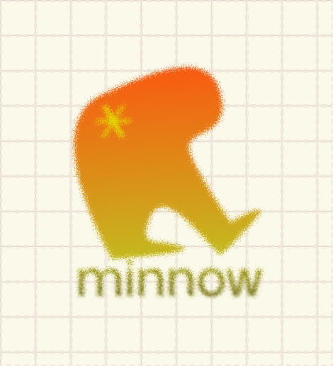
A warm orange-to-olive gradient carries the mark's "figure in motion" logic into the color system, moving from sun-warmed head to earth-toned trailing leg.
Grain texture keeps the mark feeling hand-illustrated rather than vector-perfect, consistent with the broader illustration practice.
Mona Sans (display) and Kumbh Sans (text) pair for a system that stays warm, rounded, and legible from title down to caption size.

*
minnow
FA5B11
C4BB1F
FFF5C1
422307
FIG. 02 — COLOR & FONT STYLE GUIDE
Title 48pt Mona Sans
Subtitle 36pt Kumbh Sans
Subhead 32pt Mona Sans
Text 20pt Kumbh Sans
Caption 16pt Kumbh Sans Light
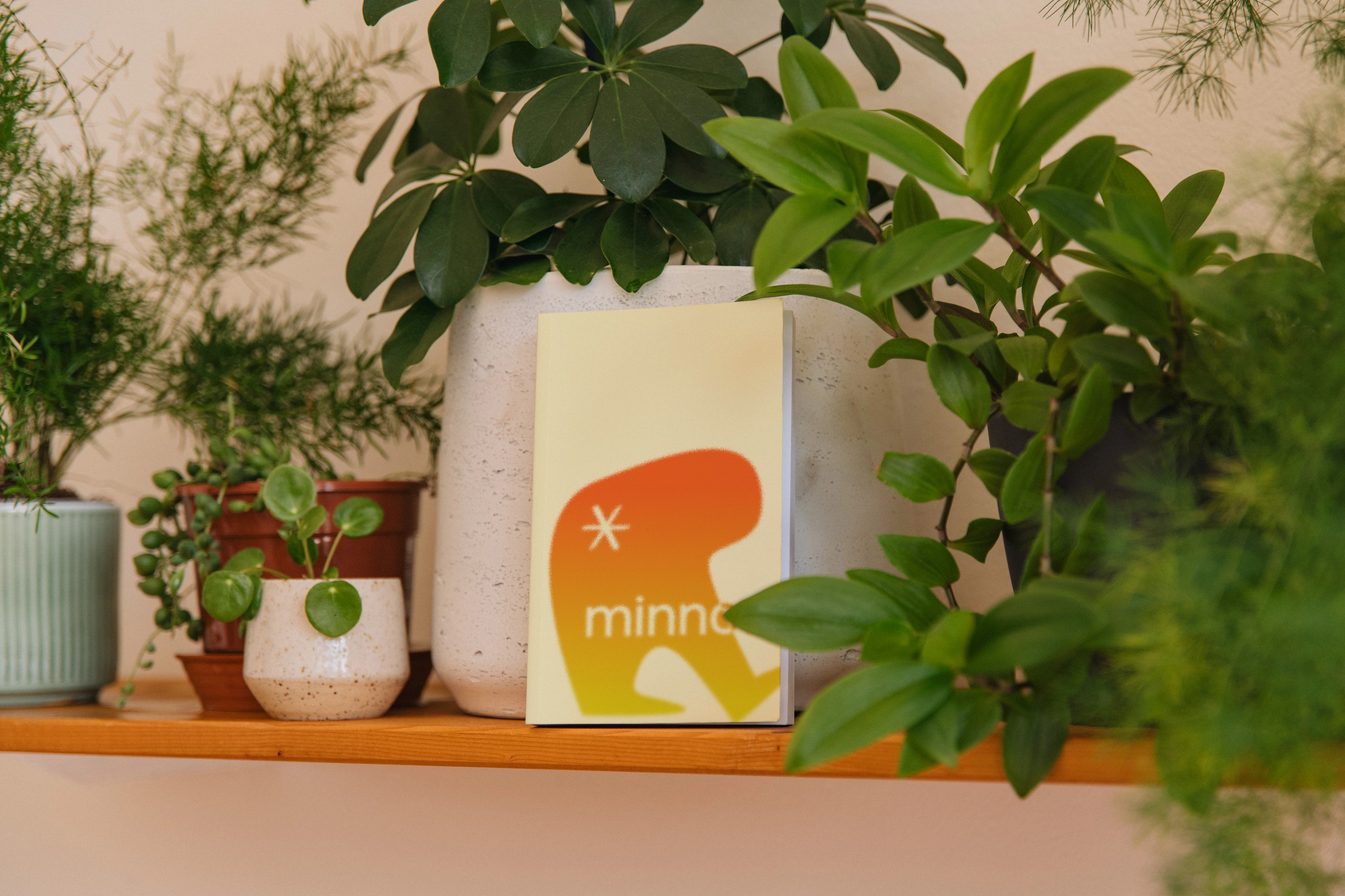
Brand System Exploration
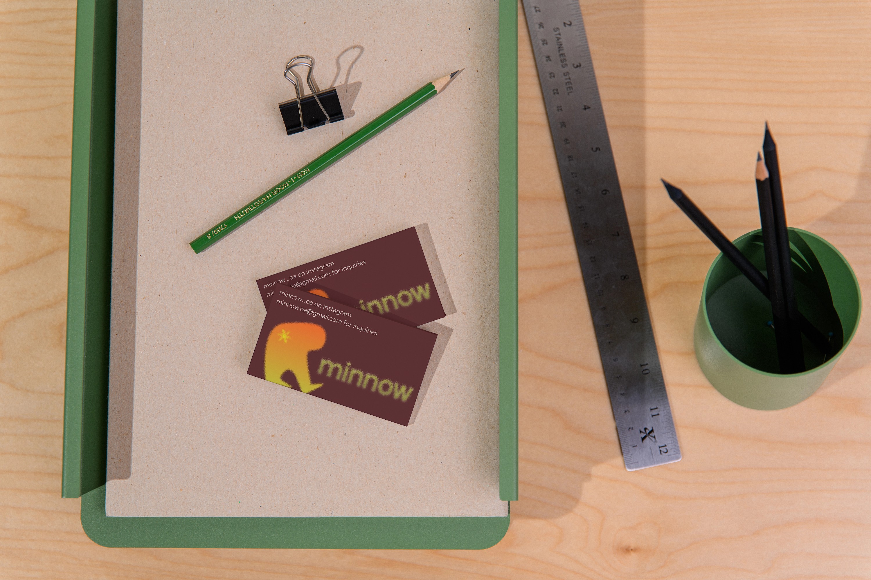
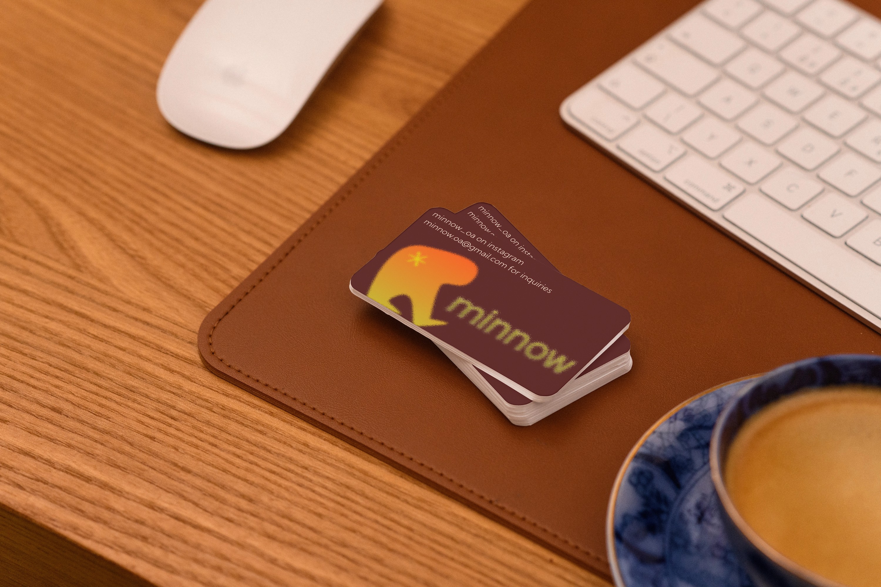
Visual assets created for posters, banners, business cards, packaging --- these complement the growing portfolio of products created by me.


*
minnow
minnow

minnow
FIG. 03 — POSTERS
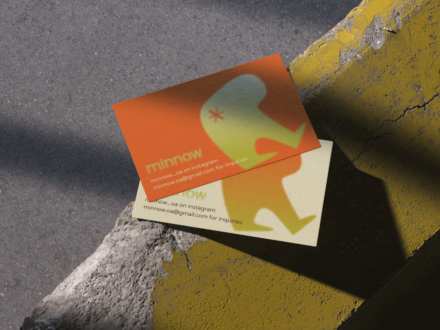
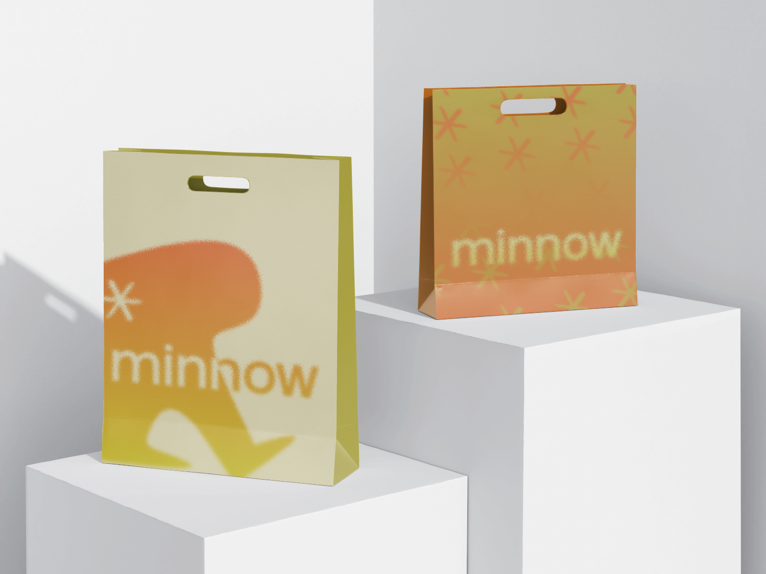
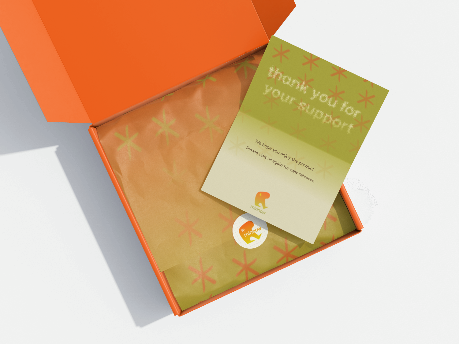
FIG. 04 — BUSINESS CARD, PACKAGING BAG, PAPER,
LETTER, STICKER, AND BOX
02
Illustration Work
Min, the figure in the logo, is a citizen in motion, searching for meaning of life.
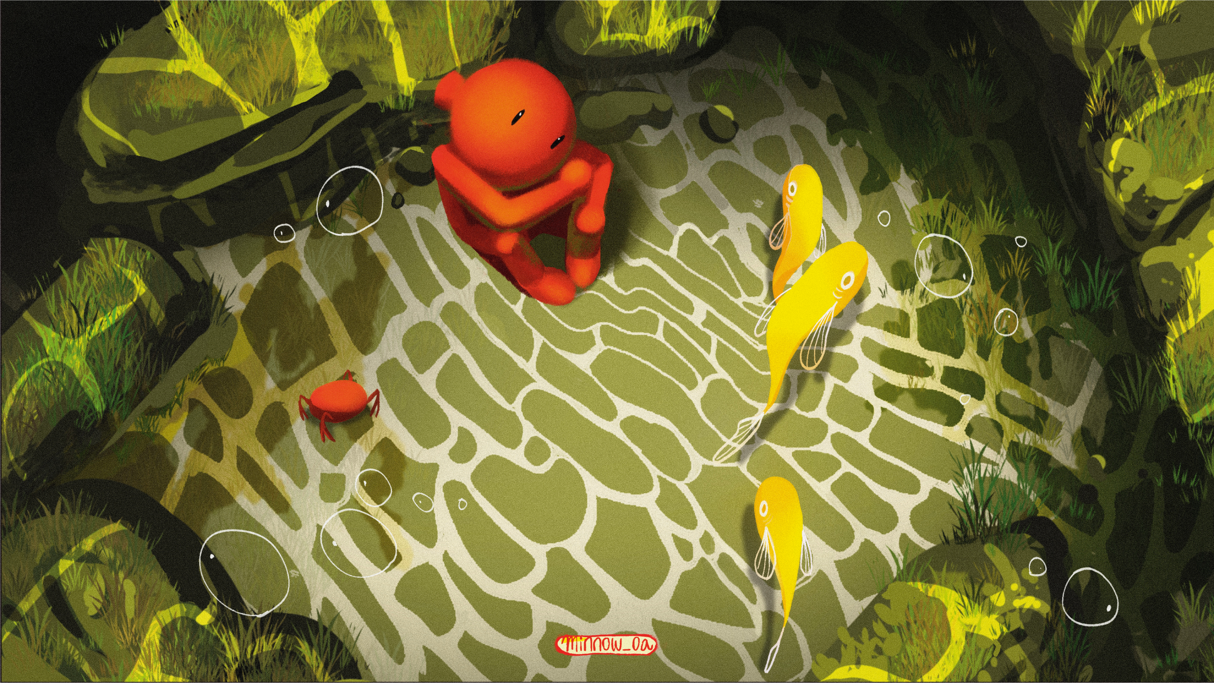
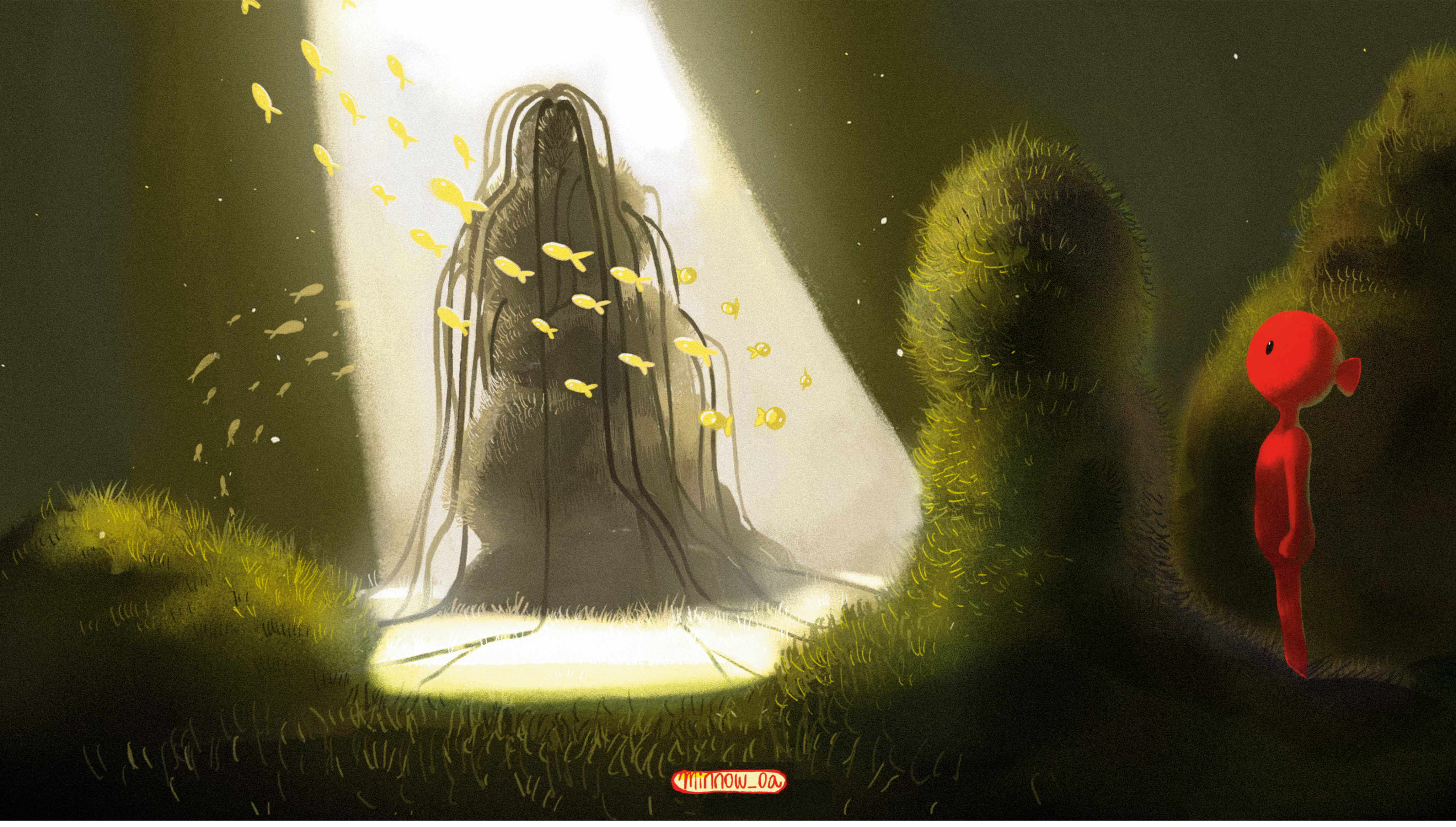
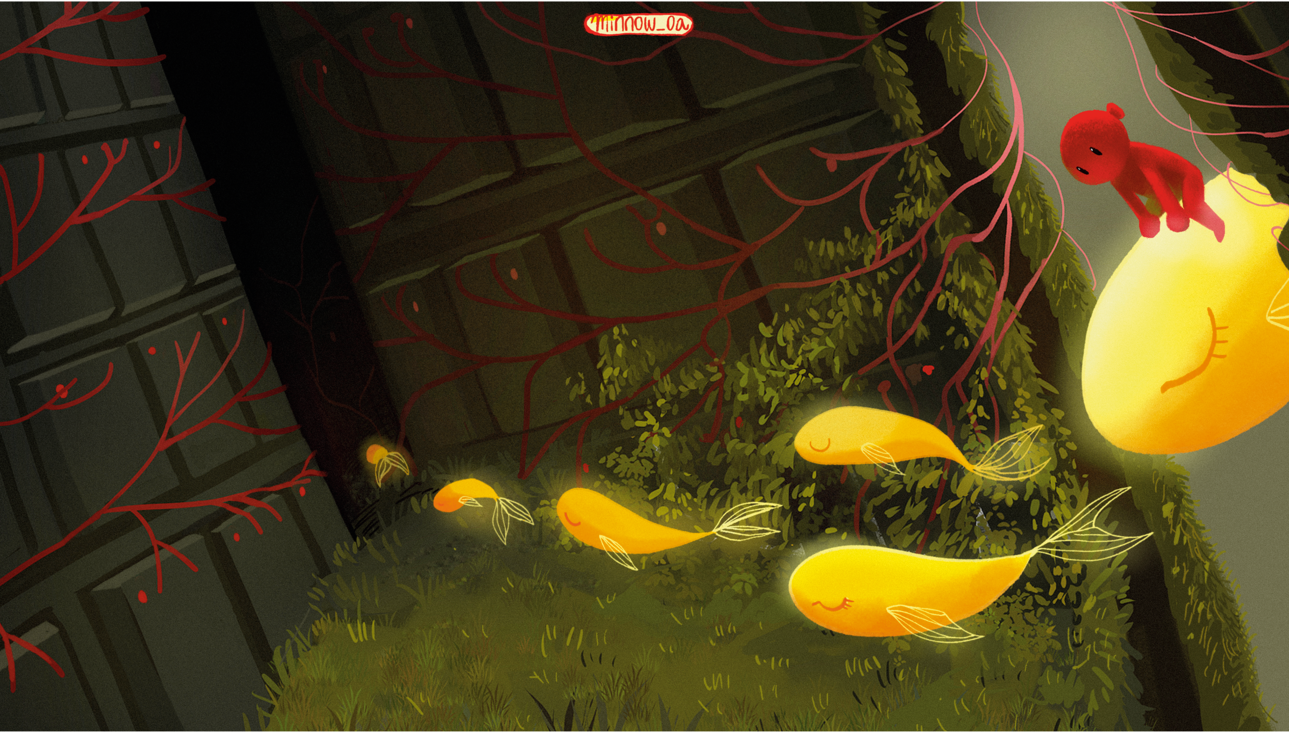
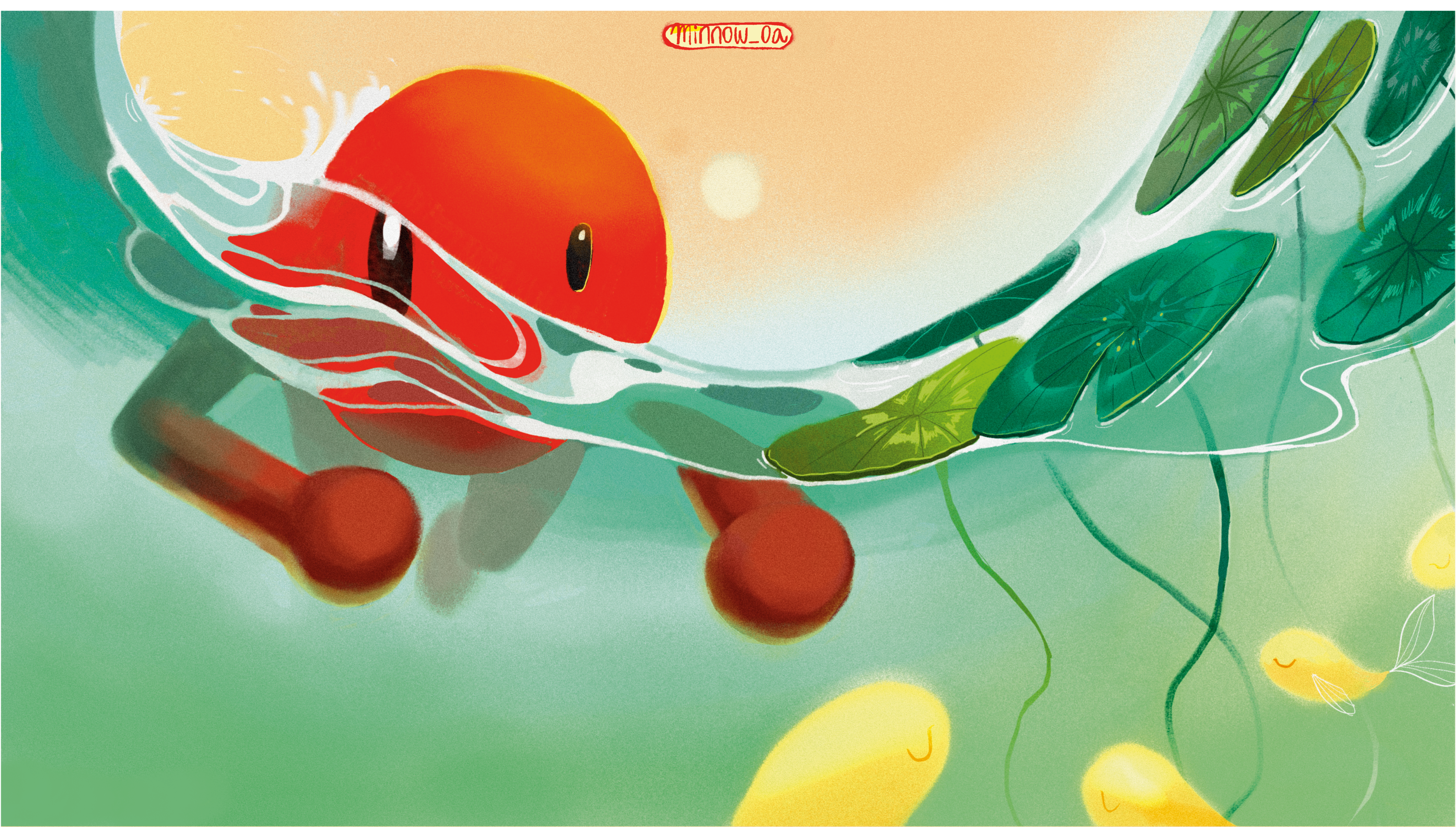
Similarly, the brand's illustration work places a small figure (rendered as a red fish) in motion through changing terrain — sea, mountain, and the liminal ground between them — in search of who they are and how to live their life.
01 — Deep Sea
02— Liminal Space & Overground
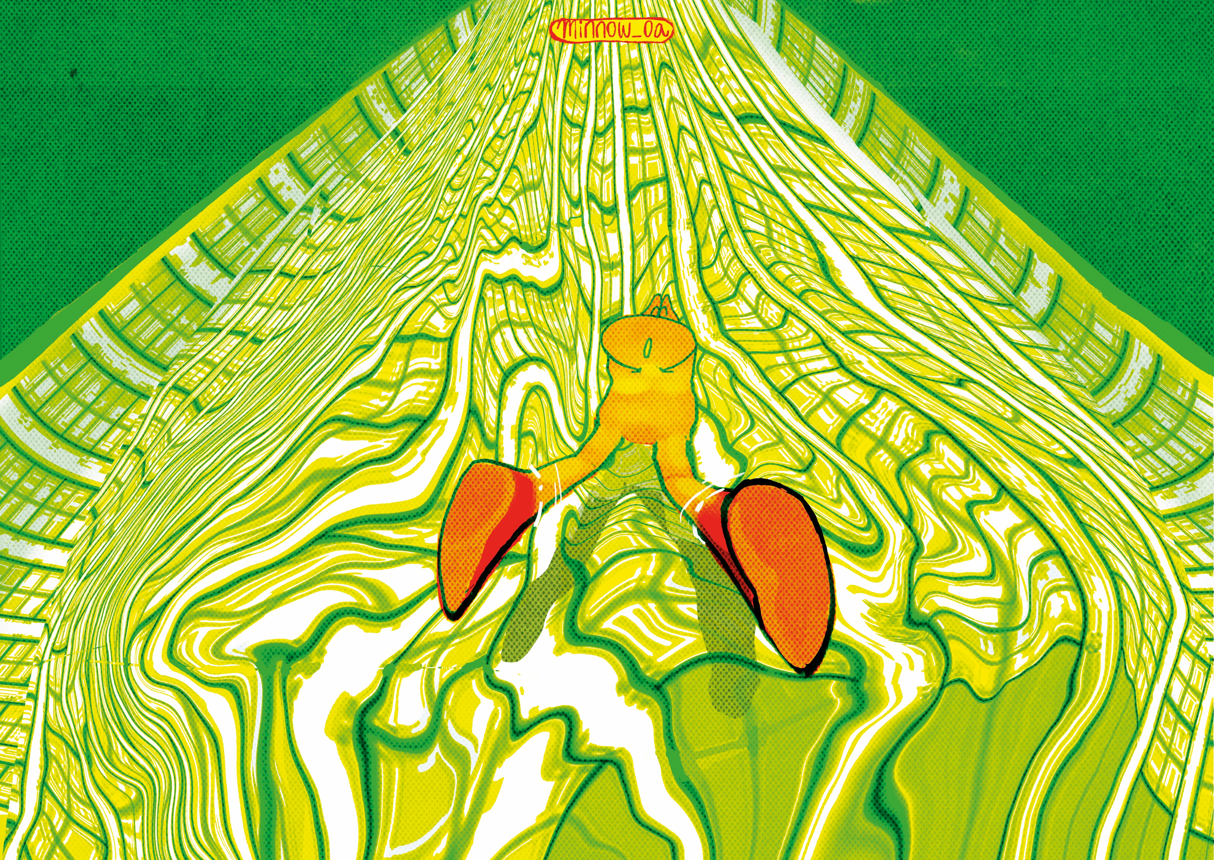


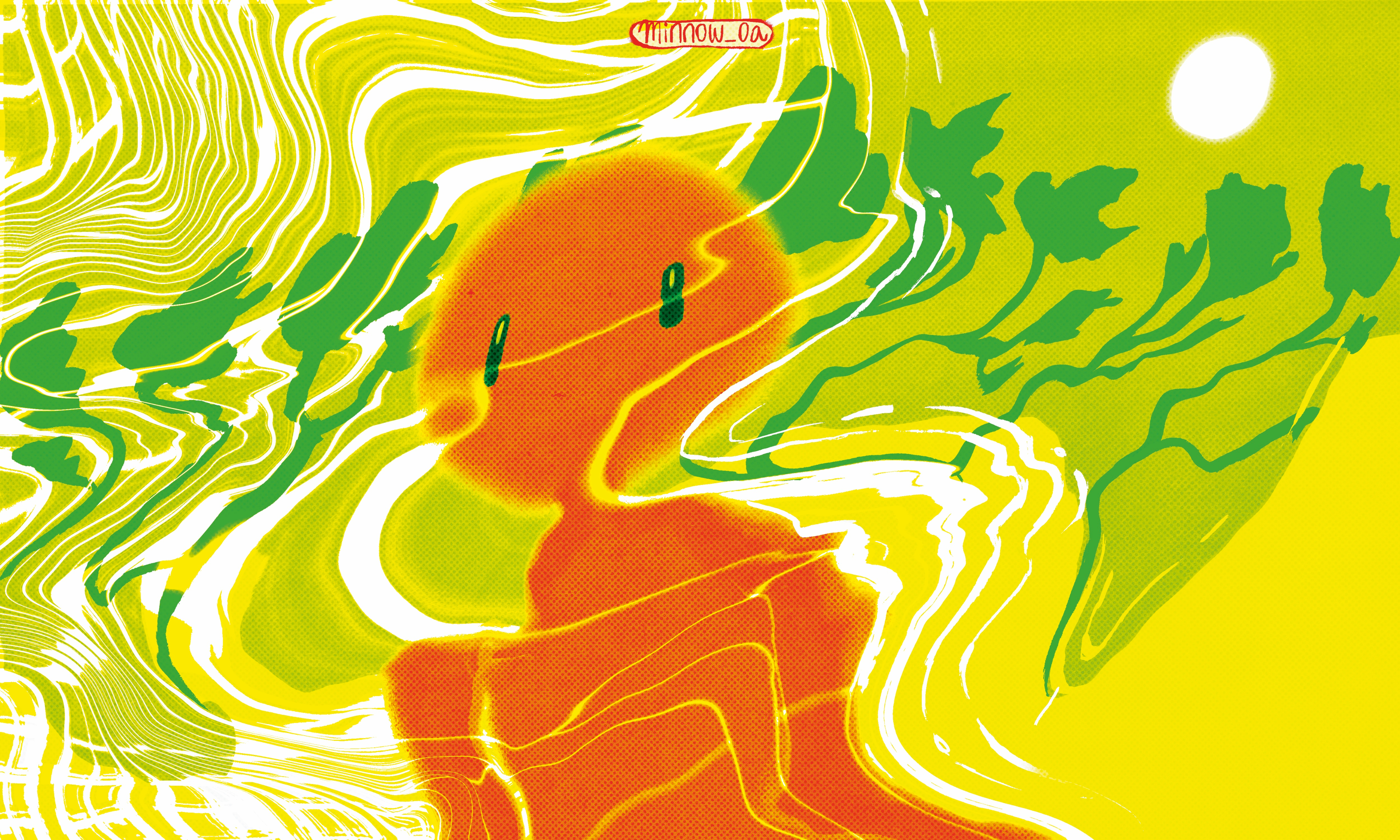
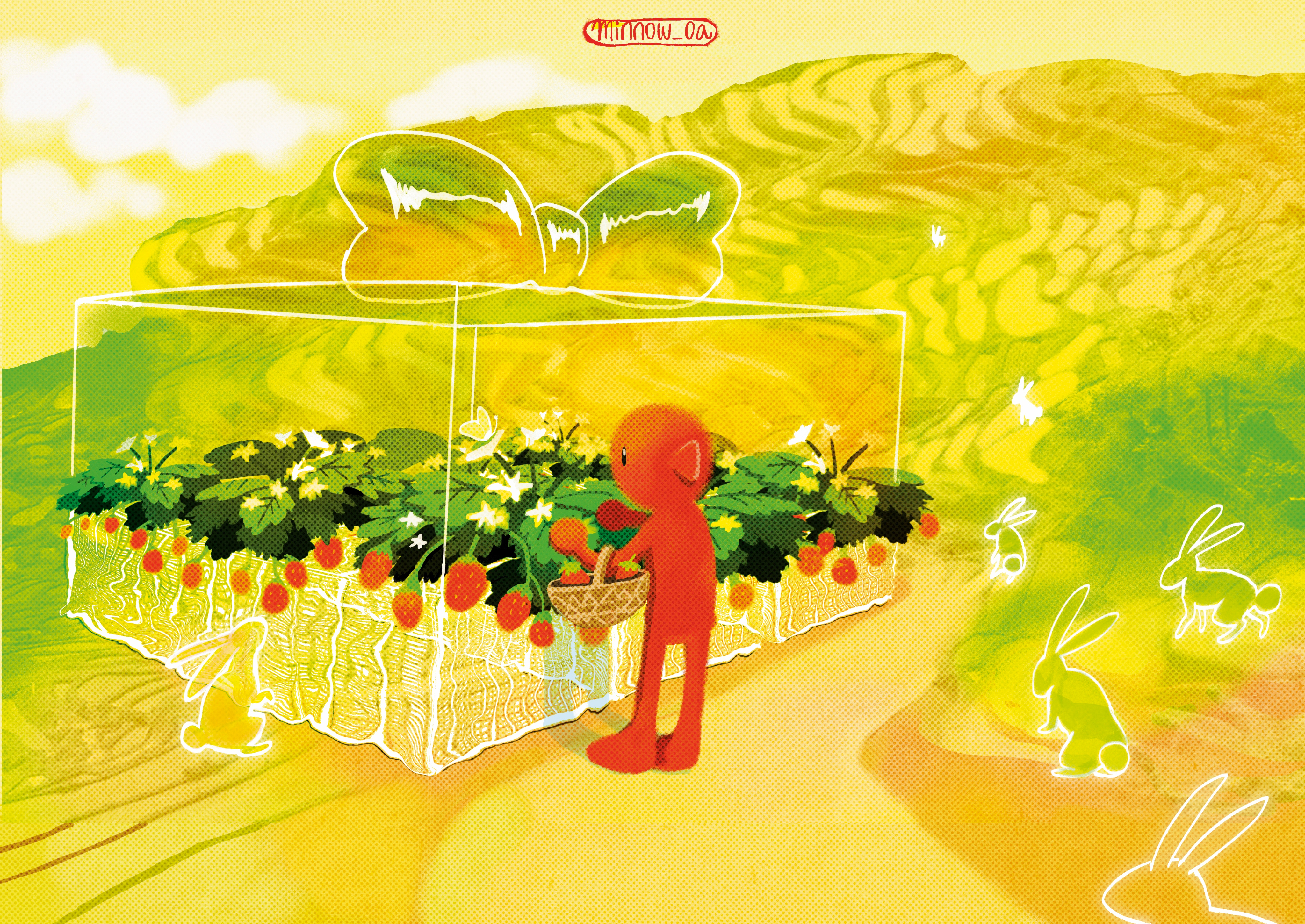
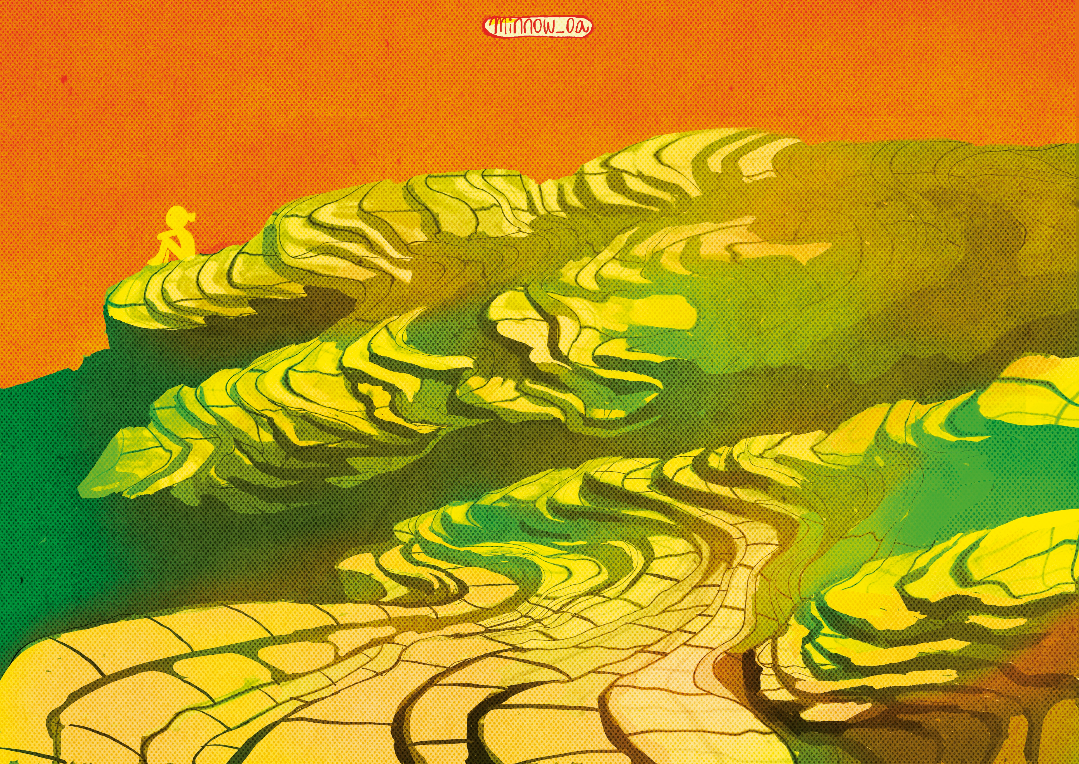
FIG. 03 — ILLUSTRATION SERIES
03
Physical Product
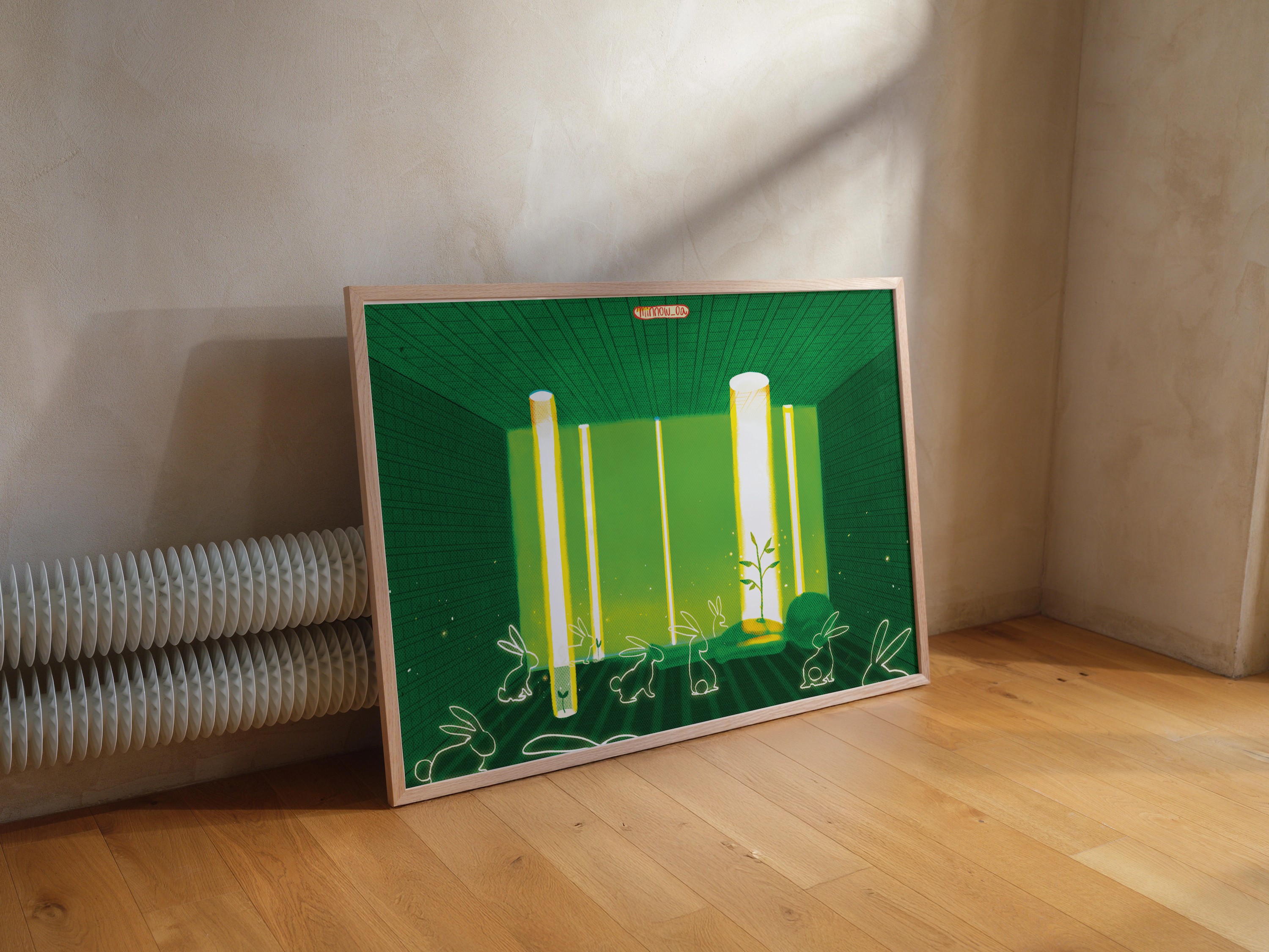
Minnow’s product line includes prints, envelopes, stickers, notebooks, and bags featuring illustration of nature in motion.
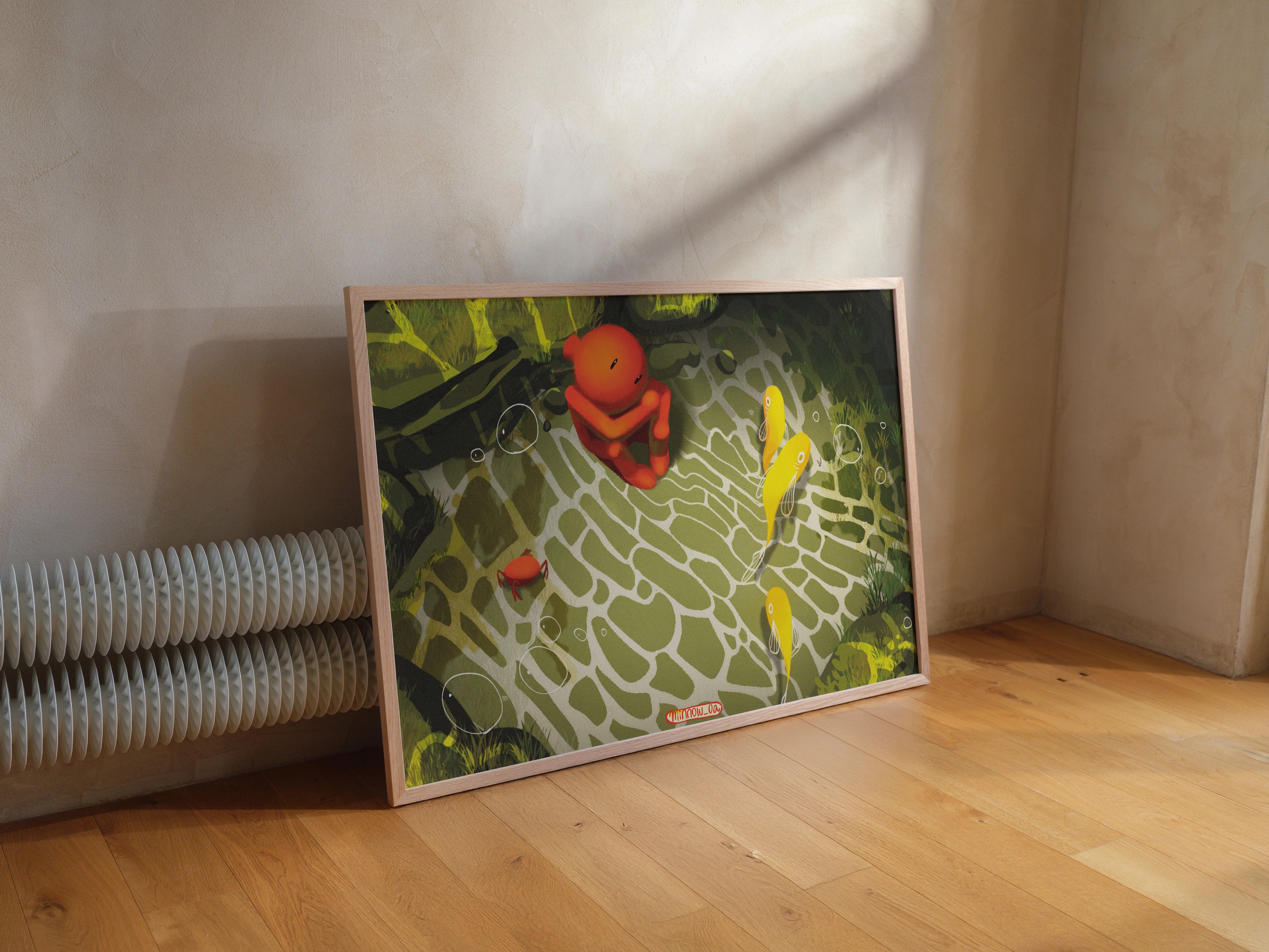
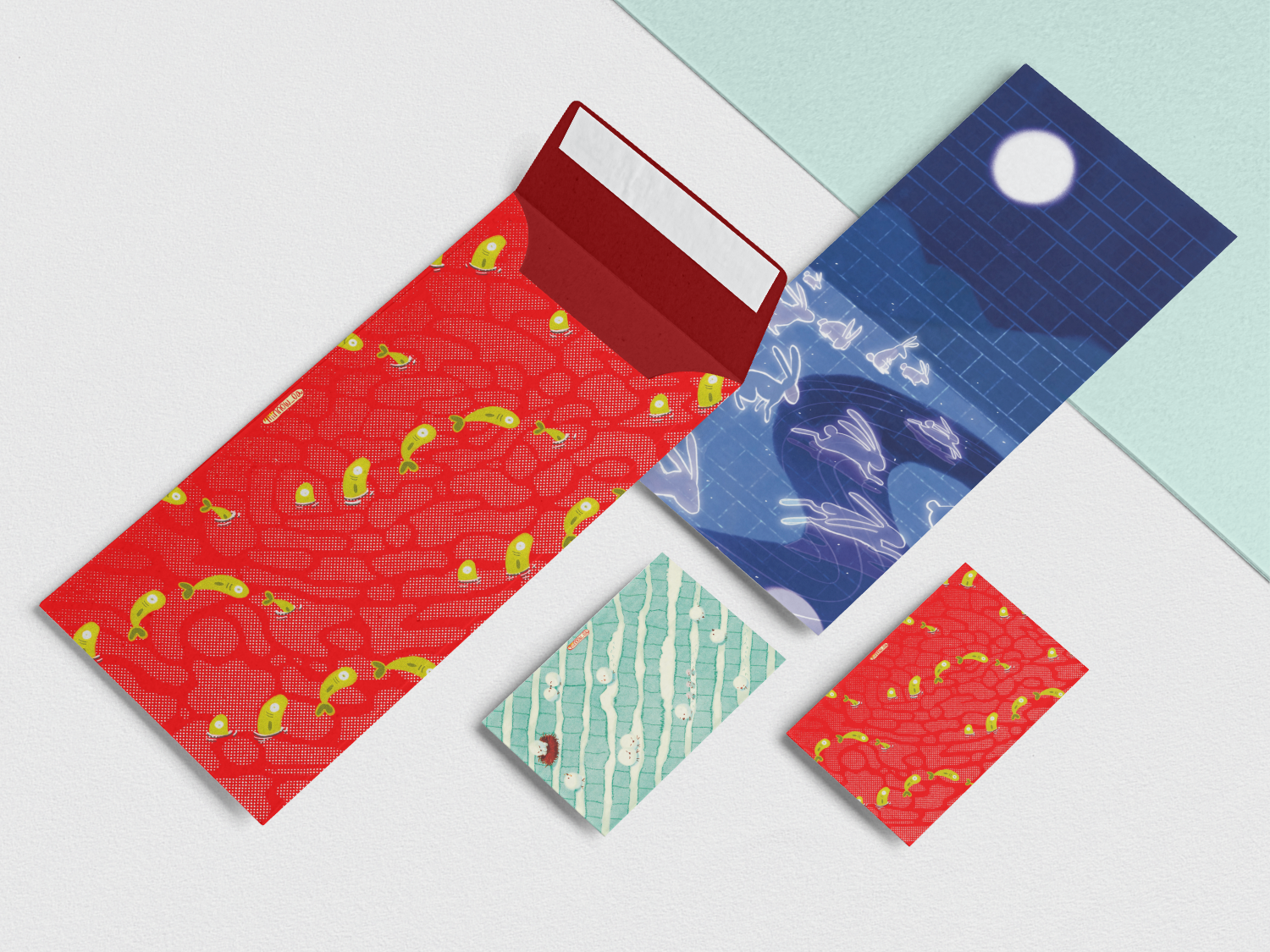
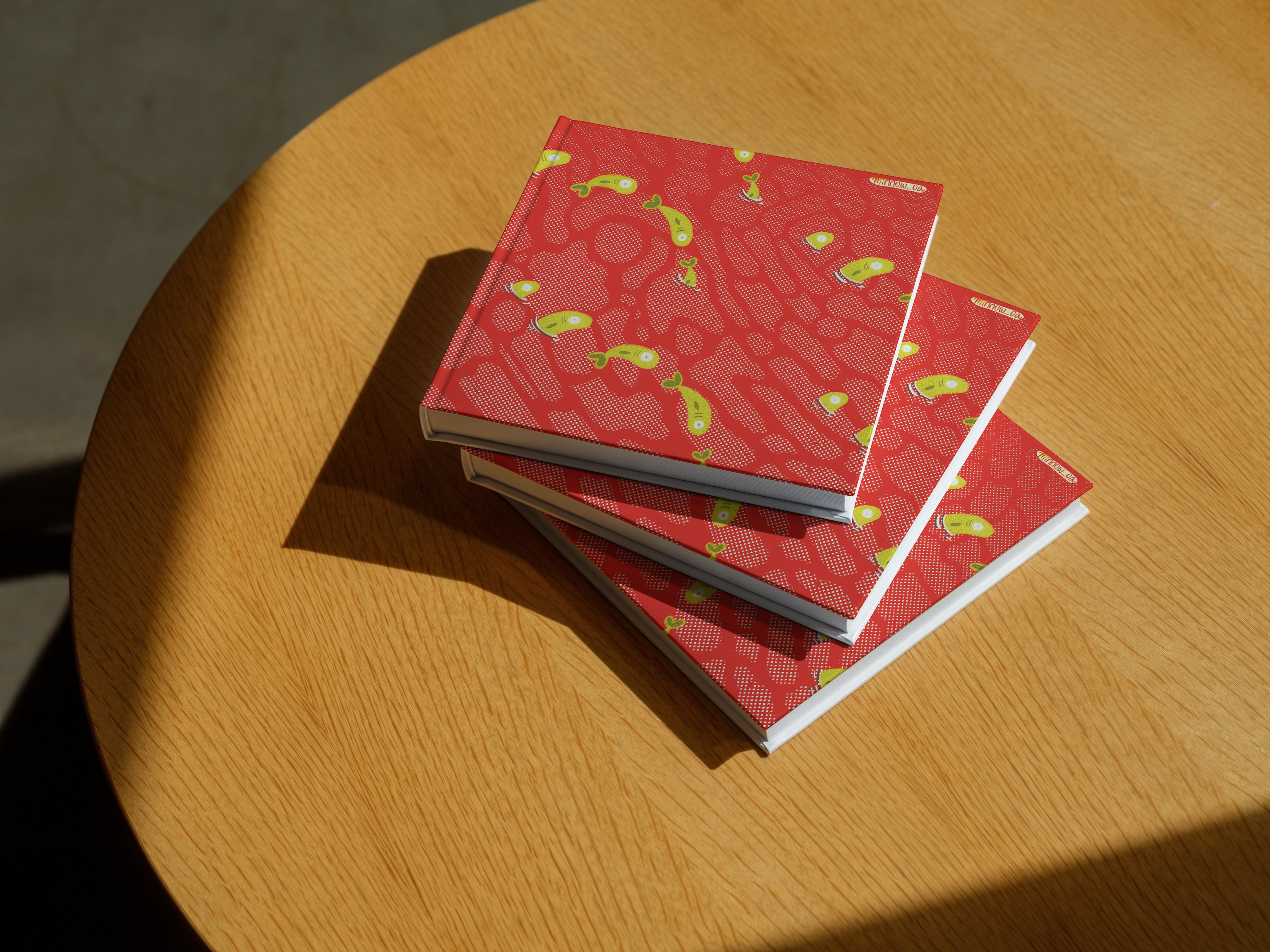
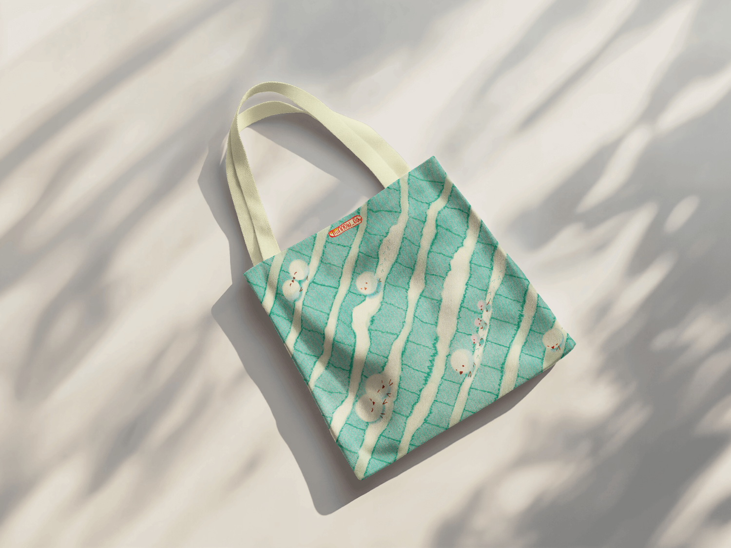
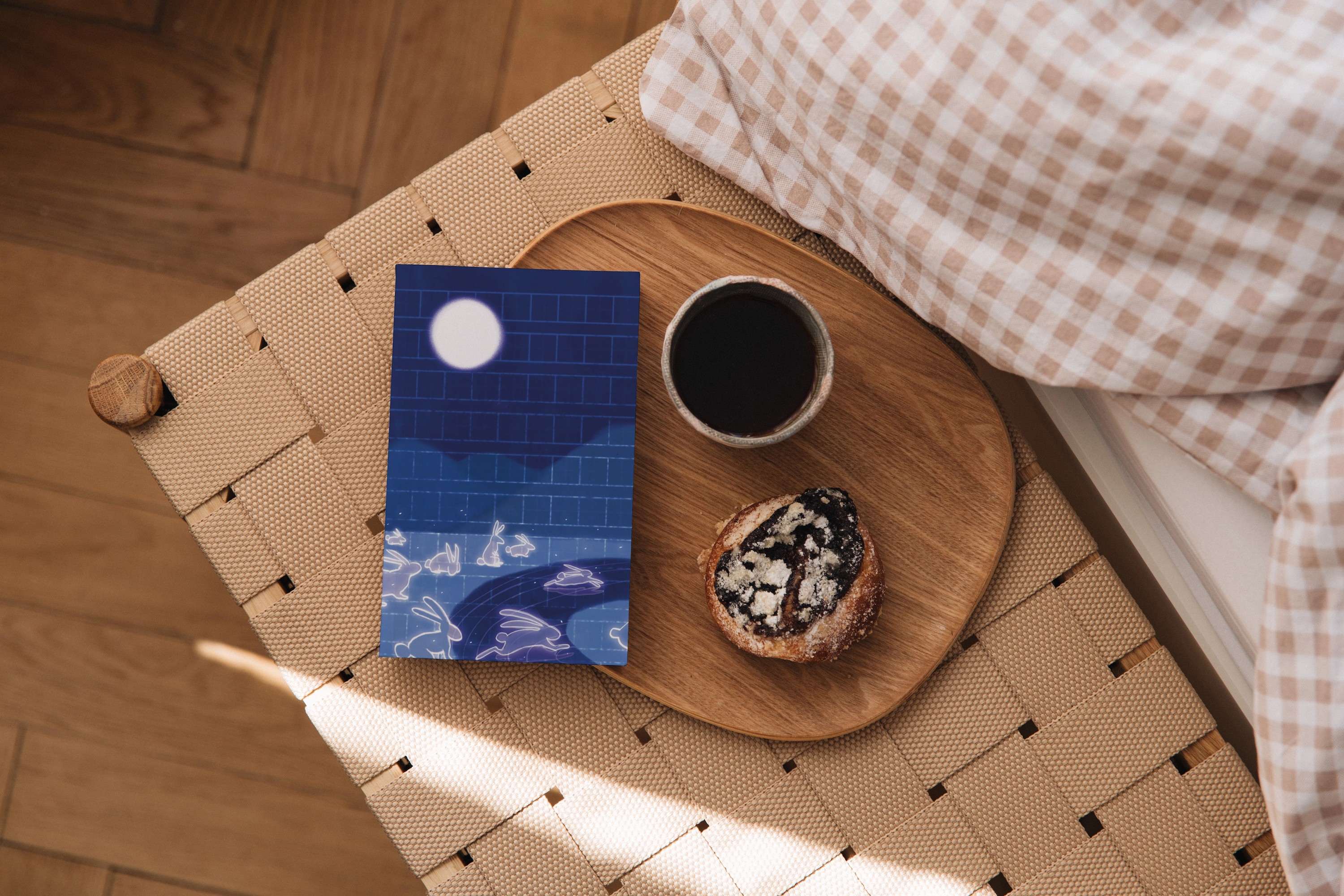
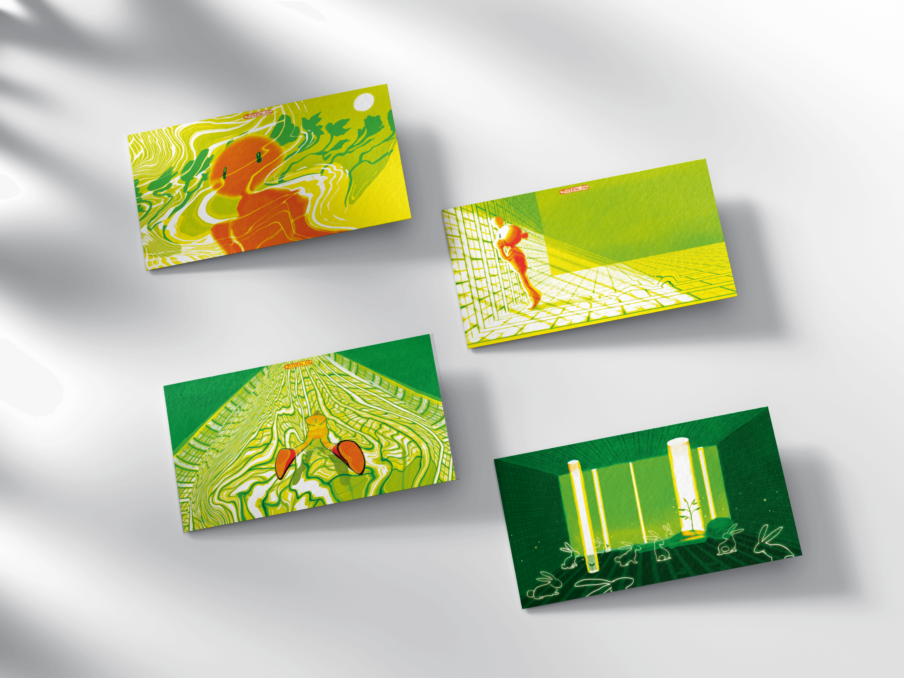
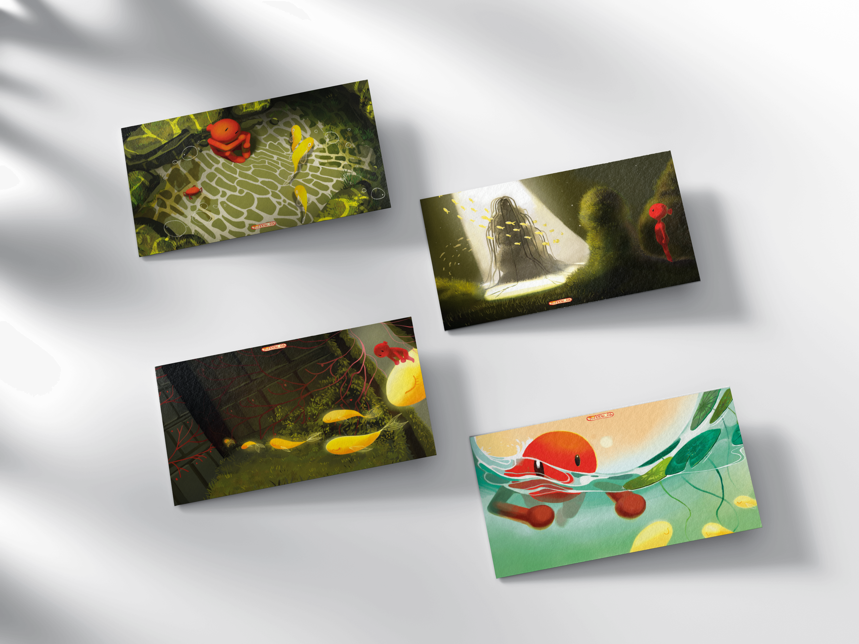
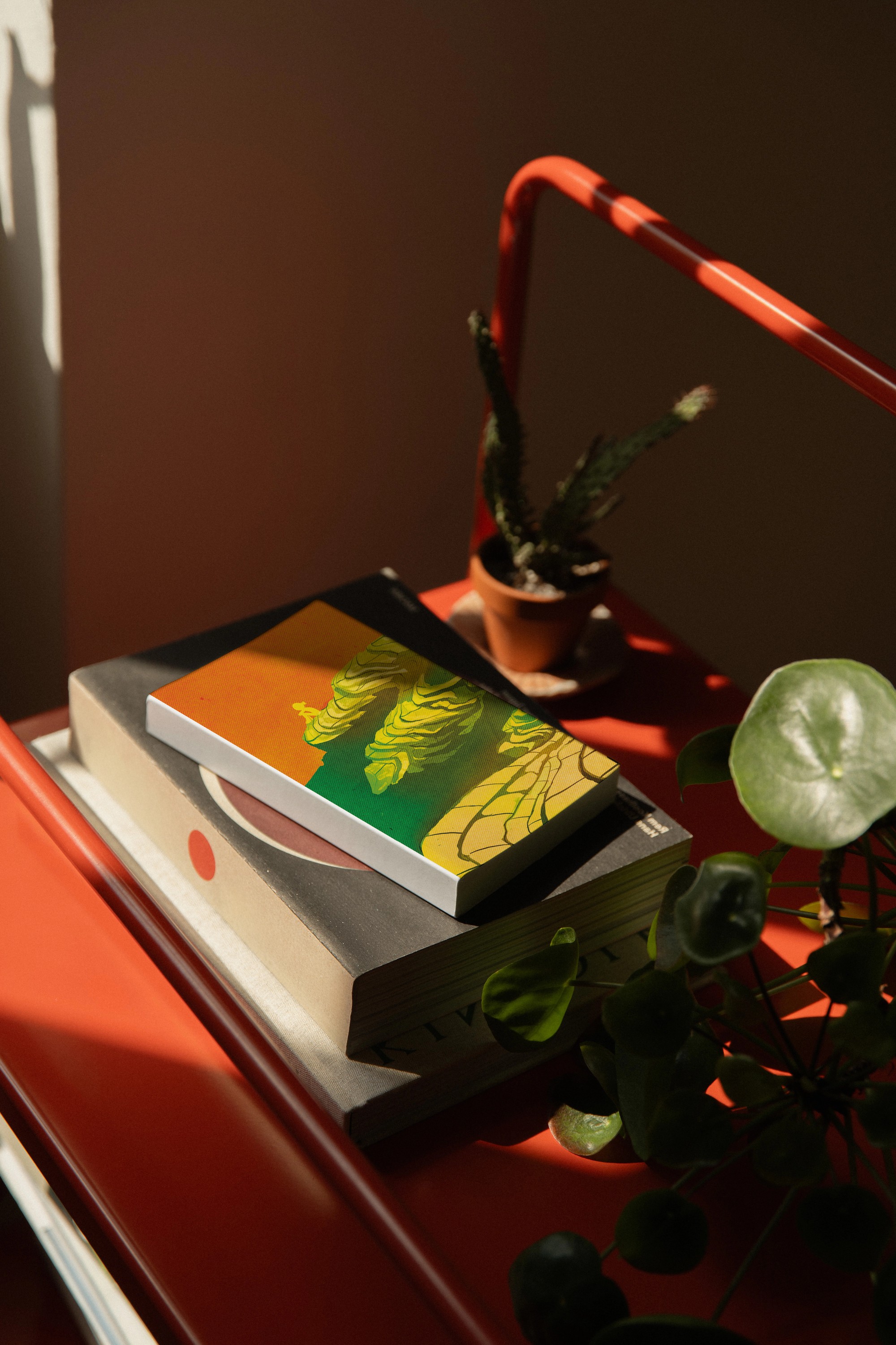
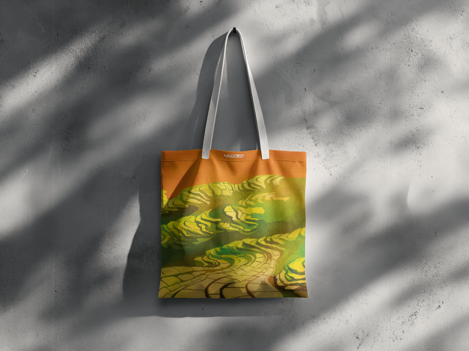
FIG. 06 — PRODUCT
Minnow — graphic design — 03/06


Minnow
A small-batch print shop with a brand identity developed around my Korean name (민) and its hanja (民, "citizen").
ILLUSTRATION · BRAND · MERCH · PACKAGING DESIGN — ONGOING
01
Brand Design
Brand name "Minnow" derived through morphological compounding of my name, "Min" and "Now”. "Min" carries a fixed identity, written in hanja (民, citizen) and is fixed further by its being a single syllable with no second character to soften or reinterpret it.
"Now" reopens that fixed identity into the present tense — in process, unfinished, still moving.
min / 민 / 民
+
now
The mark itself is built through direct formal alignment with “Min” in hanja form, “民” (citizen). Reduced to its core strokes, the hanja already reads as a figure mid-stride — a bowed head, a planted foot, a trailing leg.
The logo traces that same skeleton and compresses that visual narrative into a single static mark: a citizen (民) on a journey, captured mid-step.


*

民
FIG. 01 — LOGO DEVELOPMENT
A warm orange-to-olive gradient carries the mark's "figure in motion" logic into the color system, moving from sun-warmed head to earth-toned trailing leg.
Grain texture keeps the mark feeling hand-illustrated rather than vector-perfect, consistent with the broader illustration practice.
Mona Sans (display) and Kumbh Sans (text) pair for a system that stays warm, rounded, and legible from title down to caption size.

*
minnow
FA5B11
C4BB1F
FFF5C1
422307
FIG. 02 — COLOR & FONT STYLE GUIDE
Title 48pt Mona Sans
Subtitle 36pt Kumbh Sans
Subhead 32pt Mona Sans
Text 20pt Kumbh Sans
Caption 16pt Kumbh Sans Light
Brand System Exploration
Visual assets created for posters, banners, business cards, packaging --- these complement the growing portfolio of products created by me.


*
minnow
minnow

minnow
FIG. 03 — POSTERS
FIG. 04 — BUSINESS CARD, PACKAGING BAG, PAPER, LETTER, STICKER, AND BOX
02
Illustration Work
Min, the figure in the logo, is a citizen in motion, searching for meaning of life.
Similarly, the brand's illustration work places a small figure (rendered as a red fish) in motion through changing terrain — sea, mountain, and the liminal ground between them — in search of who they are and how to live their life.
01 — Deep Sea
03 — Underwater
02— Liminal Space & Overground
FIG. 03 — ILLUSTRATION SERIES
03
Product (print, notebook, bag)
Minnow’s product line includes prints, envelopes, stickers, notebooks, and bags featuring illustration of nature in motion.
FIG. 06 — PRODUCT
Minnow — graphic design — 03/06







Minnow
A small-batch print shop with a brand identity developed around my Korean name (민) and its hanja (民, "citizen").
ILLUSTRATION · BRAND · MERCH · PACKAGING DESIGN — ONGOING
01
Brand Design
Brand name "Minnow" derived through morphological compounding of my name, "Min" and "Now”. "Min" carries a fixed identity, written in hanja (民, citizen) and is fixed further by its being a single syllable with no second character to soften or reinterpret it. "Now" reopens that fixed identity into the present tense — in process, unfinished, still moving.
min / 민 / 民
+
now
The mark itself is built through direct formal alignment with “Min” in hanja form, “民” (citizen). Reduced to its core strokes, the hanja already reads as a figure mid-stride — a bowed head, a planted foot, a trailing leg. The logo traces that same skeleton and compresses that visual narrative into a single static mark:
a citizen (民) on a journey, captured mid-step.


*

民
FIG. 01 — LOGO DEVELOPMENT
A warm orange-to-olive gradient carries the mark's "figure in motion" logic into the color system, moving from sun-warmed head to earth-toned trailing leg. Grain texture keeps the mark feeling hand-illustrated rather than vector-perfect, consistent with the broader illustration practice. Mona Sans (display) and Kumbh Sans (text) pair for a system that stays warm, rounded, and legible from title down to caption size.

*
minnow
FA5B11
C4BB1F
FFF5C1
422307
FIG. 02 — COLOR & FONT STYLE GUIDE
Title 48pt Mona Sans
Subtitle 36pt Kumbh Sans
Subhead 32pt Mona Sans
Text 20pt Kumbh Sans
Caption 16pt Kumbh Sans Light
Brand System Exploration
Visual assets created for posters, banners, business cards, packaging --- these complement the growing portfolio of products created by me.


*
minnow
minnow

minnow
FIG. 03 — POSTERS
FIG. 04 — BUSINESS CARD, PACKAGING BAG, PAPER, LETTER, STICKER, AND BOX
02
Illustration Work
Min, the figure in the logo, is a citizen in motion, searching for meaning of life. Similarly, the brand's illustration work places a small figure (rendered as a red fish) in motion through changing terrain — sea, mountain, and the liminal ground between them — in search of who they are and how to live their life.
01 — Deep Sea
03 — Underwater
02— Liminal Space & Overground
FIG. 03 — ILLUSTRATION SERIES
03
Product (print, notebook, bag)
Minnow’s product line includes prints, envelopes, stickers, notebooks, and bags featuring illustration of nature in motion.
FIG. 06 — PRODUCT
Minnow — graphic design — 03/06